Introduction:
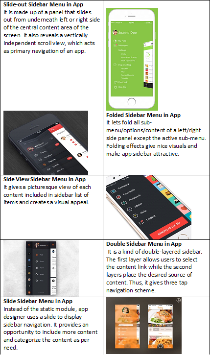
Mobile applications always suffer from screen-related constraints, and app designers strive for optimal screen real estate utilization. Therefore, the app main navigation menu is squeezing and remaining up to a few buttons. However, the need for a full navigation menu remains unsatisfied in the tiny main navigation menu. The scope for a secondary navigation scheme arises to provide a complete vehicle that brings users to their intended screens/goals. In due course, App UI and User interface designers look for secondary navigation schemes like sidebars used in most website designs, mainly WordPress websites. Unfortunately, sidebar navigation seems plausible in tablets like a bit big screens, but non-applicable in tiny smartphone screens. Expert and creative app designers and developers have devised a sidebar into an off-canvas menu. The entire menu remains hidden from the frontend screen and representing an icon only on the GUI of the app screen. On clicking, the sidebar/off-canvas navigation icon expands and brings menu buttons and content forth on the user interface and allows actions & interactions for users. In the app developer community, the sidebar navigation scheme works off the canvas and is often termed as Hamburger Menu or Navigation Drawer in Material Design.Types and Example of Sidebar Navigation in App
Advantages of Sidebar Navigation Scheme in Mobile App Design
It has many pros and cons, but the sidebar navigation scheme is gaining momentum thanks to the following apparent advantages.- App designers can use the vertical space of mobile screens optimally because most of the users use portrait mode of app orientation against landscape mode.
- It can cover several navigation options compared to the tiny main navigation bar situated either on the top or bottom of the app. Even users can scroll it further to access hidden buttons or content.
- It can provide a clear and clutter-free design if the designer is smart and experienced enough. The most significant advantage in app design is the canvas option that shifts the sidebar menu into out-of-screen/hidden mode and leaves the rest of the screen design free for appearance.
- The off-canvas sidebar navigation scheme works in contexts of the app screen present at that moment and changing the menu accordingly in real-time. Thus, a contextual navigation scheme provides you more room to accommodate extra navigation options and content that appears only in its right contexts.
Pro-Tips to Improve Sidebar Navigation of Your App Design
Mobile app developers can enhance the user experiences of sidebar navigation by following useful tips:- By prioritizing navigation options, you can get users’ immediate attention for highly important content/options.
- Sometimes hiding won’t work in favor of users, and intimidating UX of the app will always show options and make the sidebar visible.
- Please select the appropriate sidebar navigation type from the given or prevailing options and customize it.
- Fix your goals while designing the app sidebar and allocate one goal per item listed in the sidebar. It will save users from overwhelming with too many goals per item.
Mistakes to Avoid for Optimized Sidebar Navigation in Mobile Apps
Some apps are complex and require several options in the sidebar thanks to too many categories or sections in the app’s information architecture. Therefore, optimization of the sidebar or off-canvas menu is essential. Many app developers committed some common mistakes in due course and lost sidebar value at all in-app conversion. Those mistakes are:Adding Too Many Options in Sidebar Menu of Apps:
App developers define options when planning the app architecture, and the complex nature of apps have infinitive options or “Option-Creep” in other words. Therefore, they need to control several options to show in a sidebar at a time. The fix for the issue is using a contextual sidebar menu that changes according to the app screen or app section during the app journey of a user and displays only relevant options in the sidebar.Uncluttered Sidebar Navigation of Apps:
When too many options come to cover in a side menu of the app, the app designers try to accommodate more options within the constrained space of the sidebar interface. It makes app side navigation designed cluttered, and it becomes more cluttered when designers decide to place ads or banners in it to earn in-app ads revenue or marketing app offerings in the first place. The fix is to give enough space to each option and follow the rules of touch gestures that demand space for thumb touch. For visual differentiation, you can use borders by using lines of embossing the specified area and use headings of options.Un-Categorized Options in Sidebar Menu of Apps:
If you have too many options in a sidebar and it becomes a scrollable interface/module, it becomes clumsy to scroll and find random options. The fix is that you must fragment the content of the navigation menu. The best way is to fragment them by categories or sections and give block-type patterns or arrangements.Filling Sidebar of App with In-app Ads and Marketing Banners:
From the marketing and app monetization point of view, the sidebar provides awesome opportunities if ads or banners are placed in between or bottom of the option/content list. Sometimes app owners/entrepreneurs are tempted to fill up a sidebar with ads and banners in a haphazard manner. You must logically group the ads or banners and display them in safe spaces where the chances of destroying user experiences are low. Displaying contextual ads or banners makes great sense in ad conversion too.Conclusion:
We have seen the different types of sidebar designs used in-app secondary menu designs. We know the distinct advantages of the sidebar menu against all other app navigation schemes used in present app designing. Moreover, we come to know some useful tips to enhance navigation experiences using the app sidebar menu and some of the things that need to be avoided to create a better design and experiences. This knowledge is not enough to select or create a better option for your app sidebar design. It needs the help of experienced app designers accustomed to all types of sidebar navigation design and implemented successfully. It is a fortunate thing that SysBunny has an impeccable team of app designers who have achieved desired success in sidebar navigation design for an app developed on different platforms, including iOS and Android. Would you like to try out the mobile app design agency? Let’s begin a thread of conversation.About Post Author